📝 Instagram Bio Generator — get 6 ready-to-copy bios with fancy fonts, within the 150-character limit.
Optimizing Your Visual Brand Identity on Instagram
Instagram was born and has evolved under a strictly aesthetic premise. Color palettes, photographic quality, and feed layouts dictate a profile's authority. However, text formatting is frequently overlooked by creators and brands who limit themselves to the app's default typography, missing out on a valuable branding opportunity within their bios and captions.
Our advanced Instagram font changer bridges this structural gap. By mapping aesthetic symbols and standardized alphabets into the universal Unicode system, this platform enables you to design highly engaging descriptions and copy with distinct visual depth. You aren't forcing heavy custom font installations onto your server or your audiences' devices; you are delivering natively processable characters that boost your corporate or personal brand value from the very first impression.
Technical Catalog of Beautiful and Elegant Typographies
Through our interactive conversion engine, you can generate different font families tailored to international design trends and modern digital marketing:
Each artistic variant answers specific goals within your social media strategy. Elegant cursive fonts and fine calligraphy lines are perfectly suited for niches such as fashion, cosmetics, luxury jewelry, or premium advisory services. On the other hand, heavy bold text structures and boxed characters are essential assets for tech profiles, e-commerce stores, or marketing agencies that need to classify technical specs while preserving their aesthetic layout harmony.
Copy and Paste Strategies for Critical Profile Sections
High-Converting Bio Layout Structures
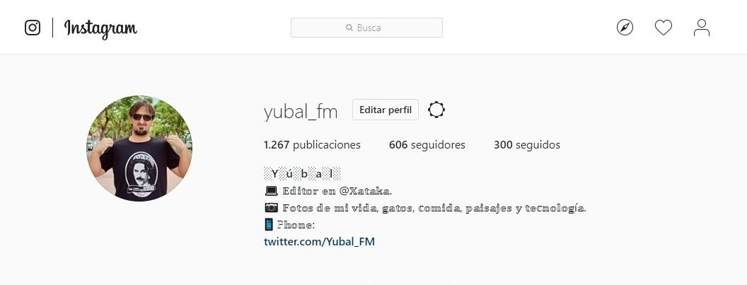
Your Instagram bio allows minimal characters to turn standard visitors into active link clicks. Apply bold fonts selectively on your core name or main niche category to guide the reading flow. Blend cursive variations to present your unique value proposition, and place clean italic fonts alongside your call-to-action (CTA) pointing to your external website or link tree.
Visual Hooks for Reels and Carousel Captions
The home feed shortens long copy blocks after the initial lines. Using robust, thick custom typographies right at the start of your descriptions serves as a visual magnet. This pulls users to tap the "more" button, directly increasing text read-time and retention metrics that the Instagram algorithm rewards when ranking and recommending content organically.

Support, Technical Limitations, and Contact Channels
Our web interface processes Unicode text with an officially verified stability rate above 99.8% across Apple iOS devices and updated Android ecosystems. However, note that heavily decorated custom layouts or double-struck alphabets might exhibit slight bugs or rendering inconsistencies on old legacy smartphones or browsers lacking character extension support.
For high-traffic commercial business accounts, prioritizing stable blocks of bold text and structured italic cursive lines is highly recommended. For any technical inquiries, bug reporting, or structural questions about the font converter, reach out to our team at: contacto@fuentesdeletras.net.
Instagram limits you should know
- Bio: up to 150 characters. Frames and symbols count too, so style one or two words.
- Name: up to 30 characters, and you can only change it twice every 14 days.
- Username (@): only plain letters, numbers, periods and underscores; fancy letters don't work there.
- Caption: up to 2,200 characters, but only the first line shows before «more».
Don't lose followers in search
Instagram search reads the Name field. If you write «𝓜𝓪𝓻𝔂 𝓑𝓪𝓴𝓮𝓼» entirely in cursive, people searching «Mary Bakes» may not find you. Keep the keyword in plain text and decorate a detail: «Mary Bakes ✦ 𝒸𝓊𝓅𝒸𝒶𝓀𝑒𝓈». Don't style hashtags either: the styled version no longer belongs to the original hashtag.
Ideas for Reels, Stories and Highlights
Use bold on the first caption line to grab attention, small caps for calls to action like «ʟɪɴᴋ ɪɴ ʙɪᴏ», and thin letters for Highlight titles. In Stories, text typed in the app uses Instagram's own fonts, but you can paste Unicode letters into text stickers.
Frequently asked questions
Why don't fancy letters work in my @?
Instagram usernames only accept basic characters. Use fancy letters in the Name field and your bio.
Do fancy letters hurt reach?
They don't reduce reach, but they can make you harder to find in search if your keyword is styled.
How many characters fit in the bio?
Up to 150, including symbols, frames and emojis.