The Strategic Importance of Custom Fonts on TikTok
TikTok is a platform fundamentally driven by hyper-accelerated visual content consumption. The application's core algorithm heavily rewards two key factors: audience retention within the first three seconds, and active interaction inside the comment section. In this highly competitive ecosystem, relying on the standard, plain text style pre-installed by your device's operating system means fading into the general feed background.
Utilizing our premium TikTok font generator is far more than a simple aesthetic choice; it is a proven technique for profile optimization. By transforming traditional text into structured layouts using extended Unicode blocks, urban graffiti styles, or bold dense variations, you can successfully capture user attention. The human brain reacts instantly to typographic anomalies, forcing users to pause their scroll to read your hooks, descriptions, and direct Calls to Action (CTAs).
Technical Dictionary of Cool and Insane Fonts for TikTok
Our interactive engine processes thousands of letter designs in milliseconds using normalized character sets. Here is a breakdown of the most requested font families for driving video views and virality:
Every single design variant carries a specific visual psychology. For instance, **insane fonts** and graffiti-inspired styles are massive hits across short-form gaming and esports communities, projecting high skill and competitive agility. In contrast, clean bold letters and high-definition elegant cursive formats are optimal for corporate business layouts, digital infoproducts, and educational creators who need to construct clean visual anchors without sacrificing readability or brand authority.
Step-by-Step Mobile Implementation Guide
Step 1: Input Your Base Text
Type your primary video hook, descriptive text, or username inside our interactive generator box situated at the top of the page. The backend script will instantly compute the matching Unicode sets.
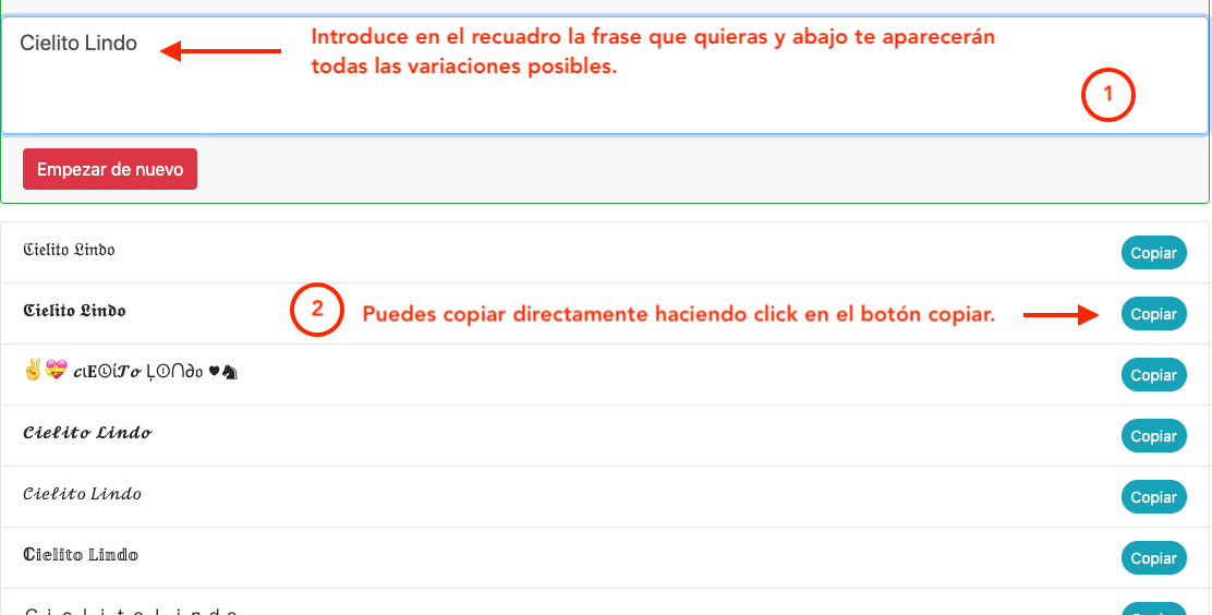
Step 2: Style Selection and Smart Copy
Scroll down vertically through the converted results catalog. Once you discover the perfect font styling that complements your content design, tap or click the box directly. The formatted text will save instantly to your device's clipboard buffer.
Step 3: Direct Paste Without Formatting Loss
Open your TikTok editing dashboard or profile screen. Long-press on the destination input field and hit "Paste". Since these are processable Unicode characters rather than external desktop font files (.ttf), your unique decorative design stays 100% intact for everyone viewing your clip.

Strategic Fields for Using Special Fonts on Your Account
To maximize the conversion impact of these custom typography tools, avoid complete text saturation and apply targeted changes exclusively across critical engagement areas:
1. The Primary Hook in Video Descriptions (Copy)
TikTok search algorithms heavily index early descriptions for internal SEO positioning. Apply thick bold or italic fonts to your description's first two keywords. This forms a visual magnet, explaining the core value proposition to your audience before they decide to skip your clip.
2. High-Impact Profiles and Gamer Nicknames (Nicks)
Plain text bios rarely turn occasional viewers into permanent followers. Build a clean information hierarchy by structuring your milestones with elegant font families, using subtle gamer symbols or tiny superscript lettering to shape a clean, professional, and memorable profile brand.
3. Trending Comments (Engagement Strategy)
Ranking high inside a viral video's comment section is a brilliant method for driving fresh organic traffic straight to your own channel feed. Replying with bubble letters or dense bold fonts guarantees your comment stands out visually, accelerating organic likes and community engagement loops.
Technical Specifications & Unicode Compatibility
Our platform runs on universal Unicode character mapping, ensuring over 99% overall compatibility across modern global mobile hardware (including current Apple iOS and flagship Android devices). However, please note that if a viewer navigates to your page using a highly outdated smartphone or an obsolete OS architecture, their browser might render advanced ornamental styles as blank rectangles or question marks (?).
As a best-practice rule tailored for maximum conversion across mass audiences, we suggest sticking to stable blocks of bold lettering, clean italics, and structured cursive lines for standard commercial placements. If you run into rare visual glitches, you can file a quick report directly to our dedicated support desk at: contacto@fuentesdeletras.net.
TikTok profile rules
- Bio: up to 80 characters, so every symbol counts.
- Name: can be changed every 7 days; the username every 30 days.
- Username: only letters, numbers, periods and underscores.
Where it makes a difference
On TikTok people decide in seconds. A bio with one highlighted word («𝗘𝗱𝗶𝘁𝘀 ⋆ ᴍᴇᴍᴇꜱ ⋆ ɢᴀᴍᴇꜱ») shows your niche at a glance. In captions, highlight the first sentence and keep the rest plain so it's easy to read.
Text inside the video
Text typed in the editor uses TikTok's fonts. If you paste Unicode letters there, they show up too, which lets you create different titles for edits and trends. Test before posting: some editor fonts don't display every symbol.
Frequently asked questions
Can I use fancy letters in my TikTok name?
Yes, in the display name. The @ only accepts basic characters.
How long can a TikTok bio be?
Up to 80 characters.
Does a styled caption lose reach?
No, but keep hashtags in plain text so they work.